![]()
Bullet Charts in Power BI: Tracking Production in High Variety–High Volume Manufacturing
In a High Variety – High Volume operation with more than one machine per operator, choosing the right KPI isn’t straightforward.
Approach 1 – Using Parts Produced per operator
You take all the parts produced by all the operators in a department and then graph the production.

The issue is that when you run SKUs which take more time to produce per piece, the production can “drop” even if nothing is wrong. But, the advantage here is that the number of pieces produced is a really natural and intuitive KPI. All the operators are used to it because the piece count is what you see on the machine counters. Even supervisors and management is accustomed to it – as orders and sales volume is reported out with regards to pieces. So even though it’s flawed, it’s easy to understand.
Approach 2 – Using Earned Hours and/or Efficiency
We could normalize across all types of SKUs using Earned Hours


Using earned hours, we see that it stays around 24 hours, with efficiency (except 3/8/25) hovering around 100% for an 8-hour shift with 3 machine assignments. This shows that performance is normalized even when different SKUs are run each day
But the issue with just using earned hours is that it isn’t very intuitive to read. The people looking at these graphs don’t naturally think in terms of earned hours the way they do with piece count, so it takes extra effort to interpret what the numbers actually mean. Is there a way to keep that familiarity of parts count while still bringing in the normalization from earned hours and efficiency?
Combining approaches
We could create a clustered column chart with primary y-axis as the parts count and secondary y-axis as the efficiency.

This helps explain dips in production, since a low piece count with high efficiency usually just means high mix of parts. But it still doesn’t solve the main problem. You can’t quickly tell how much you missed the day by. If production is 5000 and efficiency is 50% (on 3/6/25), you can calculate that the target was 10,000, but that requires a bit of mental math. Doing that across multiple days or multiple operators on a tier board becomes really hard.
We could add a target line like this –

But, that got complicated quick! All the relevant data is present but there’s so much going on in one graph (Dual axis and Combo!). This becomes extremely chaotic when there are multiple graphs for each operator per department on a tier board.
Is there a way to show all of this in a format that’s easier to read at a glance?
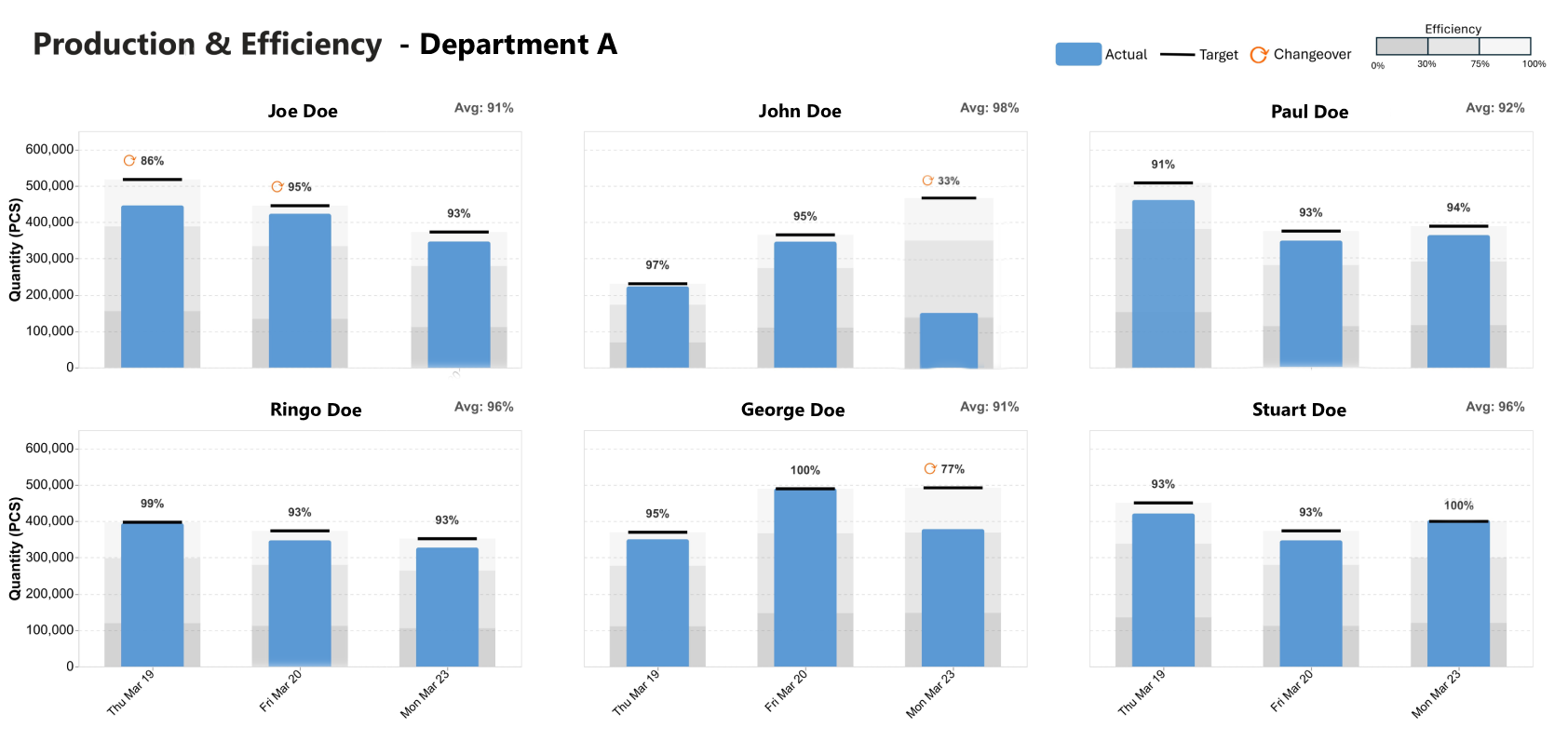
Bullet Charts
Bullet charts ended up being the cleanest way to show all of this without overcomplicating the view. The bar represents actual production in pieces, and the target line represents the ideal number of pieces for that day based on the SKU mix. The efficiency is shown as a data label on top of the bar.
This keeps the familiarity of piece count, but adds context through the target. At a glance, you can see how far off the day was without needing to calculate anything, and the efficiency gives a quick sense of whether the gap was due to performance or just the mix.
There’s a great explainer on bullet charts here by SQLBI on building bullet charts in PowerBI. It showcases the OKVIZ plugin, which is great but paid, for bullet charts but also gives an overview on building it with Deneb (which is free!). And this is what I went with. With some help from AI to write the Vega-Lite specs and a bit of iteration, I was able to put together a multi-graph bullet chart that works well for tier boards across each department.
The data behind this is just an Excel sheet where supervisors log production each day at the operator and part level, including pieces produced, ideal rates, and downtime reasons. From that, the daily target is calculated based on what actually ran. If a downtime reason is entered as changeover, it shows up in the chart as ↻.
You can find the vega-lite specs here – It’s set up to fit a full tabloid-sized canvas for 9 operators/groups in Power BI so it can be printed directly for tier boards.